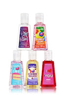
My previous post was about the PocketBacs and I thought I couldn't write a post about them without writing another post about their companions the PocketBac Holders. Just like the PocketBac their holders came in a variety of styles. There are holders that have animal designs, others have the design of cartoon characters, and there are the regular holders. The regular PocketBac Holders already come in various colors, some are one color and others have more than one. They help complement the PocketBac because one can mix and match them with the holders.This is a very smart move by Bath & Body Works because it makes it fun to mix and match them and buyers might be intrigued to buy new designs of the holders as well as new collections of the PocketBacs.
Sunday, January 25, 2015
Bath & Body Works Hand Sanitizers or PocketBac

We see these little guys everywhere, it seems like everyone has one of these. They are the Bath & Body Works Hand Sanitizers or as they call them, the PocketBacs. They came in various colors, smells, and collections. The above ones are just a few of the ones available or the ones that they have released. There are like hundreds of them. Each year new collections are launched, there are some collections that are always launched around Christmas time and they have smells from our favorite Christmas treats, other lines have been launched for Halloween season, and there are others that have been launched in the summer. Bath & Body Works has done an effective job with their PocketBacs, the designs that they have are very diverse, some come in bright colors and others are almost see through for those people that want something less appealing. The label is generally associated with the smell or the feeling that you get when you smell it. All these options have made the PocketBacs very popular, but the most important aspect of the PocketBacs is that they are hand sanitizers and I believe that this is very important because it helps reduce the spreading of germs. Not only is this a cute object but it helps to maintain ourselves clean whenever soap and water are not around
Sunday, January 18, 2015
JVC Gumy Earphones
As I was wondering what to include on my next post, I was looking at my earphones which I have in two different colors (purple and pink) and I bought a pair of red ones for my brother. Then I started reflecting on how popular these kinds of earphones have been and still are. Why is this? The JVC Gumy Earphone line has been a very popular one, I remember getting my first Gumy earphones when I was in high school approximately some 5 or 6 years ago. They continue to be a very popular type of earphones, this is because they have various colors to choose from as we can see in the picture above. They also offer different designs, one that is the in-ear headphone and the other being the regular earbud. The most recent line of Gumy earphones now has the microphone integrated for people who listen to their music in their phones, this allows them to also be able to answer phone calls without having to unplug their earphones. The option of having various colors opens the window for more customers who might want to buy them because they have more conservative colors like black and white, as well as neon colors.
Saturday, January 17, 2015
FIFA 15 PS Vita Cover
The above image is the cover of the FIFA 15 game for the PS Vita. Now this is just one of the many covers that came out for this year. EA Sports and FIFA have done various covers and depending on where you live the cover might change, the only thing that doesn't change is that all the covers include Messi as the main figure. Now as I mentioned this is just one of the many covers that came out, for the cover in Mexico we see Messi again but this time accompanied by Javier "El Chicharito" Hernandez. It seems that the two companies decided to include Messi who is the most popular soccer player at this time along with the most popular player in that country; in some countries this didn't happen and they just put Messi in the cover.
This is the cover for the US version of this popular game. In this cover we see Clint Dempsey and Lionel Messi. As mentioned before Messi is in all the covers because he is considered the best soccer player and he is very popular. Clint Dempsey is in the cover because he is one of the most popular US soccer players and he has been doing good in his career and he is the captain for the US national team. FIFA and EA Sports seem to have opted for using the most popular national players: by this I am referring to a player from that country, for example the most popular player in Spain, Brazil, Mexico, etc. By using the most popular player in the country along with the most popular player in the world (although some may argue you can also put Cristiano) people and especially teenagers, are going to want to buy this product. Another main reason to buy this is that it is rated E for everyone, even though in this image it says RP (Rating Pending). By having a game that has been rated E, parents are more likely to buy it. For example, many parents with younger kids sometimes struggle to find a popular game but that is age appropriate because most of the popular games are rated T for teen or M for mature. Another reason this game may capture the attention of many people is that it is available in various gaming platforms. I only put the cover for the PS Vita for the purpose of showing a cover but it is available for most if not all the most popular gaming systems today. All of these details are what makes this game a very popular one although its overall design may seem a bit simplistic.
Sunday, January 11, 2015
Mascaras: Are They Really That Different From Each Other? How Are They Being Advertised?
What is the difference between all the different mascaras? How are they each labeled within the same brand name? For this post I'm focusing on the Maybelline line of mascaras, because they are only ones that I personally use. I can't be talking about the Revlon or Covergirl mascaras and compare them with each other and each brand line of mascaras if I don't know the actual effects that they might have in my lashes.
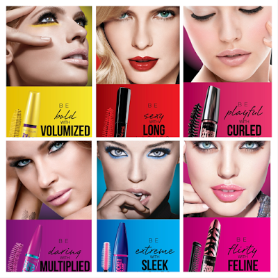
So as we see in the image above, there are six different kinds of mascaras from Maybelline. There are more but in the image only these appeared, they seem to be the most popular ones not only because they appeared in this image but I know this because when I go to the drug store they are the ones that go out of stock faster. Also, Maybelline has taken out a couple of new mascaras, and because of this they might not be in this image. For each mascara the company uses a set of words; the first word describes how you might feel when using this mascara (according to them of course), the other word describes the "function" of the mascara. As we can see the word that describes the "function" of the mascara is bigger and bold so that it can stand out to the possible buyer and depending on the result that they want to have in their eye lashes the might be more inclined to getting that mascara. For example, many women who buy mascara want to have volume in their eye lashes, therefore buy seeing this image in a drugstore they might go for the first mascara in this image which is the Colossal mascara. This image might be a good resource if it is your first time buying mascara, but after a while a after experimenting with various mascaras one may find that you can get the same or better results with another mascara.
The company also uses words to describe how one might feel with each mascara. In the first image they say that you will be bold with that mascara. Are you really going to feel bold? It depends on the person, some may feel bold when using the purple Falsies mascara. Also sometimes or most times the images may be altered to make the product they are promoting stand out. The person buying this product doesn't really know what they are going to get or the results of using this product until they actually try it out themselves. For the most part the images seem accurate to me, this is comparing my results from when I have tried these products. The overall advertising of these products is effective because of the company's use of words to describe the products and because of the bright colors used. The different angles in the images help show the function of each mascara.
Saturday, January 10, 2015
Nature Valley Box
The image above might be one of the many boxes that one may see when we go to the grocery store. There are many types and brands of snack bars. As we can see it has the usual Nature Valley logo that states that this snack bar is 100% natural. Why is this so important? Right now it seems like almost everyone is opting for healthier and more "natural" food. For many people eating something natural may be equivalent to eating something healthier. Because of this many people pick foods or packaged items that say "100% Natural", whether they are really 100% natural we don't know but that is the logic that some people have. By just having the 100% natural sign this product is attempting to provoke interest in people that are trying to make healthier and smarter choices. However, this is not the only type of consumer that the product might be trying to reach for. This product can also be aimed towards people that are in a rush, like college and university students. Another element in the box is the picture of the snack bar. Like in most snack bar boxes or cereal boxes, the photo of the bar is enlarged so that the consumer can look at how good this treat looks. The almonds, oatmeal, raisins, and the other bits of fruit and nut are showed in a way that catches the consumer's attention. In the bottom right hand corner there is also an enlarged picture of the individual fruits and nuts that are in the snack bar. The company does a good job promoting their product and making it look appealing to the eye and by having the enlarged image of the snack bar it also gives us a sense of almost being able to taste it. Visually it communicates very well and another good thing about the design in the packaging is that although there are some words the images are more appealing which to me this always has to be the main focus in the labels or packing of boxed products.
Subscribe to:
Comments (Atom)

